
Similar Posts
Gogo in Zepeto!
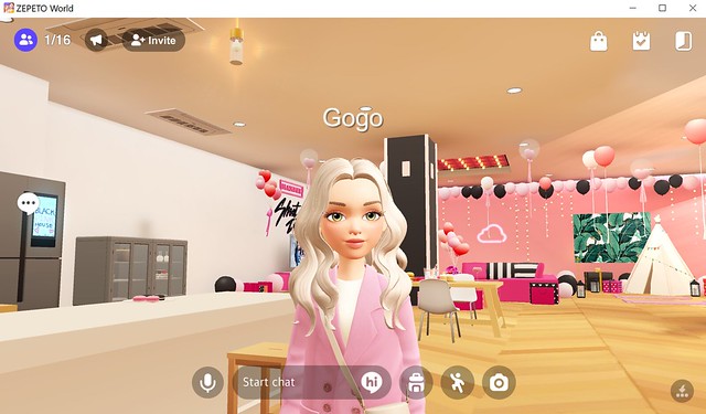
@ the BlackPink World Hello from Zepeto world! This mobile virtual world is created by Naver, a South Korean company, and is immensely popular with over 300 million users. I had never heard of it before until a few days ago when I saw Truth Hawks promoted his brand Super Fun in Zepeto. You can now dress your avatar in even more Truth stuff in other worlds!

Follow JuicyBomb on Zepeto! I decided to try Zepeto, and in just a few minutes, I had a cute avatar that looks like Gogo. Within 24 hours, I had invited several Second Life friends to join, taken photos, made videos, and even set up a social media account like Instagram.
One of my favorite things about Zepeto is that I can pose with friends even when they aren’t there. Zepeto has these things called Express with booths, which are pre-made templates for videos and photos that come with music and poses. You can go into a booth, add members (yourself and your friends), take a photo or video, and either upload it to your feed or download it to share it somewhere else. This only takes a few seconds, which is why I like Zepeto so much.
It’s like a mini-version of Second Life for your phone, and they do so many things right that I can see a lot of Second Life users and people who just like fun dress-up games playing this.
Read More “Gogo in Zepeto!”New Exile Hair

Exile has just released two new hairstyles, the Ciara style has a side-braid and perfect for adding hair flowers or other hair accessories to it. Megan is a casual updo with a scarf wrapped around the hair and tied into a bow on the side. The scarf is texture-changeable and includes 6 Spring-y colors!

I'm wearing the newly released Salopette denim overalls outfit from Anuenue.
What I'm Wearing:
Gala Phoenix – Classic (Dew) Skin
Wild O – Juliet White/Blue Flowers
Exile – Ciara (Harlow) hair
Exile – Megan (Harlow) hair
Anuenue – SalopetteDenim (navy)
Elate! – Pink Rose ring
50 flats – Cherry FlatsBOOM Bikinis
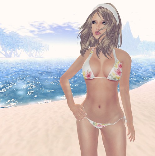
BOOM is my favorite new place to get all things Bikinis! Everything is sold as separates so you can pair a string bikini top or halter top with thongs, string bikini bottoms, bikini bottoms or boyshorts. I like wearing matching patterns but you can totally mix-and-match the pieces for a unique look.
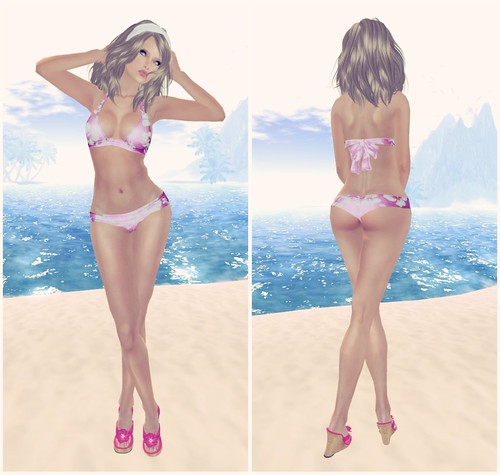
The style and prints on these bikinis are so sweet, it’s beachy, happy and *not* slutty at all! Even though I don’t mind slutty either 😛
Visit Boom, you’ll be sure to find something perfect for the beach here 🙂
A discussion came up recently about how some bloggers use Photoshop to hide flaws in items and I can assure you that’s not happening here. When I do use Photoshop, it’s for very simple things like Cropping or rounding out sharp edges (I rarely ever do this cos it’s too time consuming).
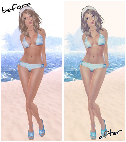
I do like messing around with Picnik from time to time, and you can tell cos it’s totally obvious. The left image is the original shot straight from SL, and the right is with a slight cross-process cos I love how retro that looks.
Are you guys feeling deceived by yet? LOL!
What you see is what you get here, to the best of my abilities from in-world tools. I won’t go out of my way to correct design flaws.
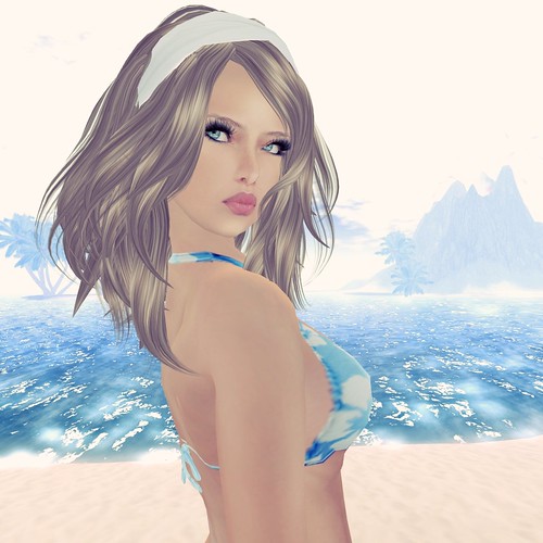
This hairstyle is a new release from eha! The Megu hairstyle features a color-changing headband, but it’s also mod so you can tint your own color, too. Visit eha!
What I’m Wearing:
eha – Megu (Strawberry) hair
LeLutka – Lola (Light) Base (L Brows)
LeLutka – Lola (Lipstick) Nature Matte)
BOOM – Floral White
BOOM – Hibiscus (Lt Blue)
G-Field – Wedge Tong Sandal- Fashion | Hair | Uncategorized
Me, you’re all mine!
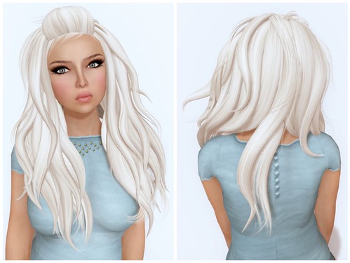
Elikatira released the new Me hairstyle, and it’s simply adorable! I love the name, it’s very appropriately named. I think everyone who sees this hair will go, omg that’s so meeeeeeeeeee!

This pretty new Sunday Morning Tee from Ingenue is so casual and cozy and pairs perfectly with the Balcon Lounge Pants from mon tissu. I am loving my outfit today, it’s very casual and easy on the eyes.
What I’m Wearing:
Elikatira – Me (Blonde 05)LeLutka – Gem/Golden-Makeup5Tuli – Eyeliner 5Ingenue – Sunday Morning Tee (Aqua)Mon Tissu – Balcon Lounge Pants (White)AddiCt – Chocolate Ring (Copper)ANEXX – BowBalletFlats (White) Maeve ~ Sneak Peek!
EDIT! Maeve skins are no longer for sale, til further notice.
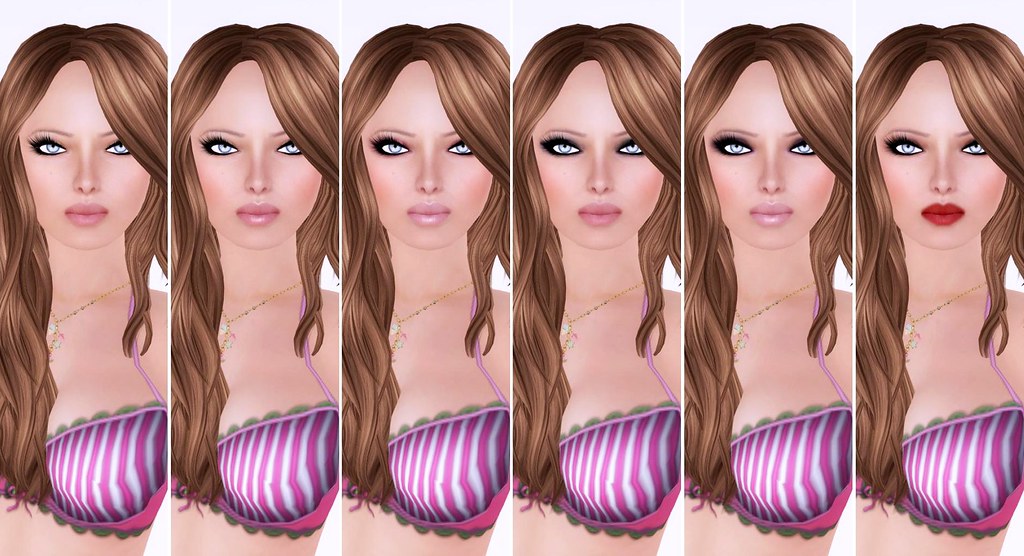
New skin creator, Mae Moriarty will be launching her first skin line tomorrow! Shown here is the Maeve skins in 'Apricot' skin tone and all six makeups. Each makeup includes a Blonde brows and a Brunette brows option.
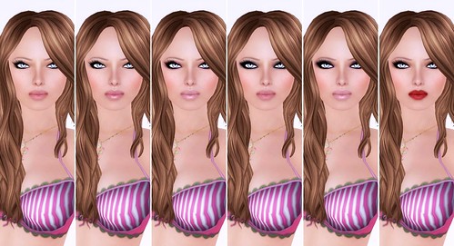
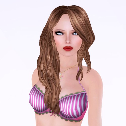
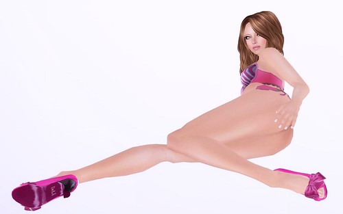
I'm excited about these, they photograph really well and have a sweet face.
Join the MAEVE update group in-world to be informed of all the latest news about the launch.
Tp to Maeve
Popsicle
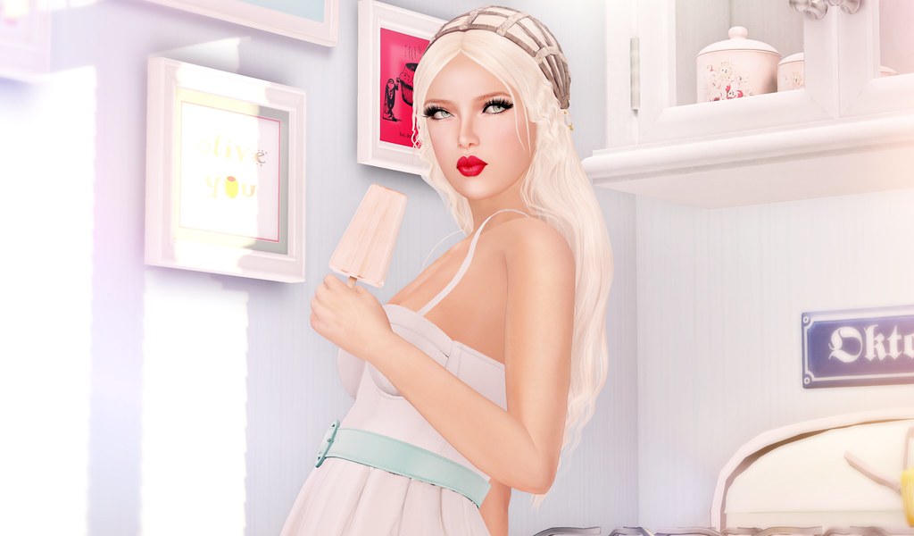
Good morning SL! Let’s share a Popsicle.
I need to clean my inventory, but the objects folder is scary now. If SL had a feature to “unpack all boxed items” from within a folder, I would be so thrilled. I can’t wait for the holidays, so I’ll have a whole week to sort and purge my inventory, before the new year! I like to start every new year in SL with a slimmer inventory (~50K or less), which is a good number for someone who has a lot of stuff! I know other bloggers who have in excess of over 100K inventory (looking at you, Sasy Scarborough).
What’s your inventory size? Do you sort and purge obsessively? Let me know in the comments!
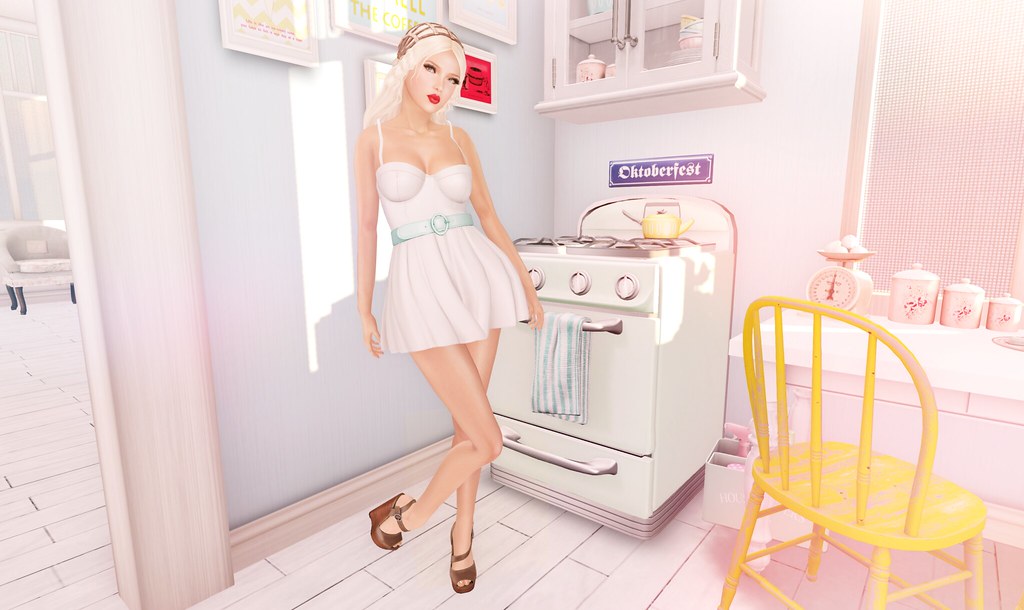
What I’m Wearing:
Pink Fuel Skin
LeLutka – Lillian Hair (Marilyn)
Teefy – Tiffany Bodysuit (S) White
Teefy – Katharine Skirt (S) White
L.Warwick – Miranda (High Platform WEdge) Modest Mahogany
That skirt would be good if the pants layer blended with the prim skirt better, otherwise – cool.
Hey Gogo, what skins do you normally wear? They are so striking, I’ve been meaning to ask for ages…
Hiii Hachi! I tend to switch between different brands. I guess the ones I wear the most are Minnu Model Skins (by Minnu Palen) or Gala skins (by Gala Phoenix). I like them both for different reasons, so some days it’s really hard to choose which one to wear! 😛 I change my skin/hair/clothes about 5x a day.
Where are those eyelashes from? Lovely!
Thanks Gogo for posting these! The skirt needs to be better fit to Gogo’s frame, perhaps that is why it doesnt blend so well 🙂
Thanks again!
Lila
These are Cake – Bedroom Lashes (FNKY Cake sim)