
The new Yu-IV and Cordelia skins from Mother Goose has a sweet and young look to them. I prefer younger faces, but these may be better suited for teen or even older kid avatars.
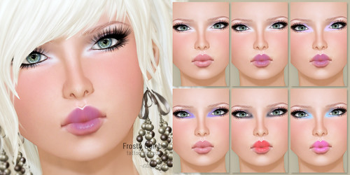
The Yu-IV skin includes 6 makeups (with teeth option), 3 blush tattoo, 2 b rows, and one eyeliner& lashes tattoo.
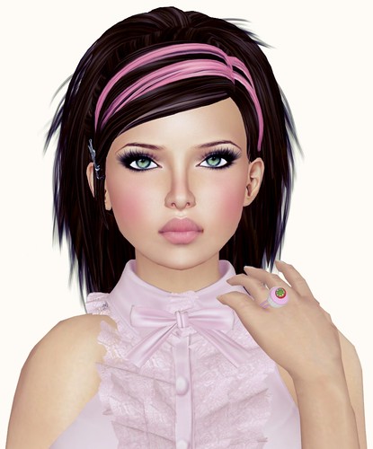
The Cordelia skin includes 5 makeups (with teeth option), and 2 brows tattoo. You can wear the Yu-IV blush & eyeliner& lashes tattoo with this skin, like I have in the picture above.
I’ve always liked Mother Goose cos the skins are inexpensive, and the faces are unique and fresh. One of the things that I think they can improve on is to offer more skin tones!!! I’m usually not too pale or too tan, so sometimes their skin doesn’t work for me.
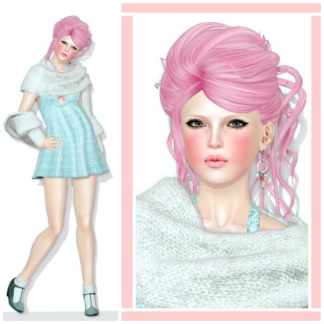
What I’m Wearing:
Exile – Loveshack (BabyDoll) @ My Attic
Atomic – Endearing Earrings (Platinum)
Monso – My Warmer Muffler (White)
Drift – Flirtini Dress (S) Lace
Maubray – Marijen Wedge w/ Sock


That is the first skin that I have ever seen on you that doesn’t look like GoGo
Is it the skin or the shape? It just looks odd
Your comment about Mother Goose’s skin being either too pale or too tan brings up an interesting point, which is the change to the base expectations of avatar shape and skin in Second Life.
When I started SL six years ago, which is an eternity in virtual time, skin makers aspired to realistic flesh tones, and shapes ranged from curvy (think “Playboy bunny”) to “generous” (think “Nicki Minaj”).
I recently went shopping for new shapes and skins to see if I could fresh up my look and learned two things:
First, new shapes are considerably slimmer than the old ones on average. I normally wear a medium in mesh; with the new shapes, which were represented as “curvy” by their creators, I was wearing a S or even an XS, depending on the item. I was also quite a bit shorter at the base height.
Second, new skins are also considerably paler, by several tones, than even the “fair” skins I got from Redgrave a couple of years ago.
Wearing both the pale skin and the thinner, shorter shapes together, the result was that I looked like jailbait. And not well-fed jailbait, either.
The new base look in Second Life seems to be informed by anorexia, “heroin chic”, with a dash of paedophilia thrown in. Shapes and skins now skew towards a younger and younger look while the average Real Life age of the Second Life resident is middle-aged at least. I also see a LOT more child avatars in Second Life than when I started, as well as “teen avatars” such as those sold by Danika.
Sorry, I know you’re here to sell things and enjoy Second Life. I won’t blame you one bit if you “moderate” my comment out of existence…but in my humble opinion, skin sellers such as Mother Goose are part of a definite and disturbing trend towards encouraging people in Second Life to look like teens or kids. Some people argue there’s nothing sinister in it; I’m not one of those people.
Hi Veronika,
I’m approaching seven years in SL myself and I have seen the same trends. But those same trends exist in modern fashion, and SL art, imitates life. From the vantage point of making money, designers are going to do whatever the masses want, and vamp teen is very in right now.
That doesn’t mean we shouldn’t raise awareness about avatar psychology and educate others about the complexities of body image though, so I for one applaud your observations.
Like most, I have multiple avies in SL. But my main IS me. I use her for education and networking (I’m a school library media specialist). She has my real name and I do my best to make her look exactly like me.
I’m 33 and I look it. I would love to find tattoos that add fine lines, maybe even some laugh lines round the eyes. And I would love it if designers gave gray hair options as my grays are starting to come in. They actually look really cool and I’d like my avie to share that. But, despite my best efforts, I’m starting to look older than my avie.
The majority of people are going to want to go for young and fashionable, for a variety of reasons. But some of us would love to see more options out there. When you live in a world where everybody is tall, young, gorgeous, and perfectly symmetrical, it can sometimes get a little boring.
“When you live in a world where everybody is tall, young, gorgeous, and perfectly symmetrical, it can sometimes get a little boring.”
I used to have this quote from a Sheryl Crow song in my profile: “We can’t be certain who the villains are, ‘cos everyone’s so pretty.”
I tried to age my avatar as much as I have been able to within the confines of SL. I was barely 18 years old when I started SL and I have managed to take my virtual Veronika from late teens to my current age of 24. I’ve achieved that mainly by dressing more maturely (no more hoodies or sneakers) and wearing more grown-up hairstyles.
Aging the virtual me to reflect the real me would be a problem if I stayed longer in SL, but I’m phasing out my SL life and only log on for an hour a week, and sometimes not at all for two weeks or so. I feel out of place among all the sexualised children and “gangsta teens” and have nothing to say to them, so I guess they are the inheritors of SL. It will be interesting to see what happens to adult-themed clubs (such as nude beaches and the escort places) once SL is populated largely by teen and child avatars. All I can say is, it’s a good thing for Linden Labs that the mainstream media ignore Second Life these days.
I hope some designers will decide that there are people who want a more mature look and will provide a way to do that. I wouldn’t hold my breath if I were you, though. When one of the growing tends in Second Life is 45 year old men who are pretending to be five year old girls with “mommies”, the chances of any designer having the vision and nerve to go in the opposite direction are small, indeed. I would love to see some folks with grey or greying hair and so forth.
I don’t have any alts. I may be the only person in SL who doesn’t. I understand why other people have them, but as with you, Carina, my SL avatar *is* me. I couldn’t be anybody else.
In response to the above comment, I wish to point to the fact that Mother Goose is primarily designed for Asian avatars. Although since they serve a wide audience now, it’s up to the designer to decide if they want to include a wider range of tones or not.
One more thing–if the designer does not offer a wider range of tones or a more mature look, that doesn’t mean it should be read into, or fabricated that the designer is contributing towards that trend. Maybe some people like their avatars to *not* represent themselves, or want them to look dollish. Maybe some of us, don’t want to put too much of ourselves into Second Life.
I am not accusing Mother Goose or any vendor of sinister motives. As Carina Gonzales pointed out: “From the vantage point of making money, designers are going to do whatever the masses want, and vamp teen is very in right now.”
I know a lot of people who LOVE the pale skins, and not just for Asian avatars. My analysis was more about a broader trend in Second Life over the years, not a comment on your particular product. Sorry if there was any misunderstanding or if I gave offence. I intended neither.
<3
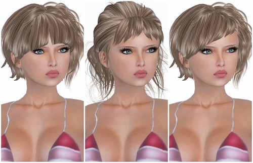
The third one all the way to the right looks weird. The middle area around the nose and between the eyes looks either dirty or bruised. I can’t stop staring at it.
For too pale skins there is a good solution may be skin-tone tatoos.
For such a thing like skin tone even a small difference plays a big role, so a tone tatoo that’s transparent and subtle enough would warm the skin up a bit and not cover the shading in any noticable way.
They can ruin the lip gloss shining tho, so it gets orange instead of white. Needs a hole around the mouth so it doesn’t happen.
Your styling doesn’t suit Mother Goose’s skins at all. It looks weird on your shape.